Tutorial Project - Redshift
The project described on this page can be found in the examples repo on GitHub under the name Redshift-Tutorial.webgmex
Pipeline Overview
Pipelines
Basic Input/Output
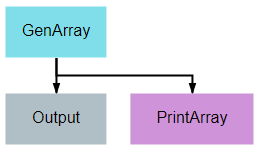
This pipeline provides one of the simplest examples of a pipeline possible in DeepForge. Its sole purpose is to create an array of numbers, pass the array from the first node to the second node, and print the array to the output console.
The Output operation shown is a special built-in operation that will save the data that is provided to it to the selected storage backend. This data will then be available within the same project as an artifact and can be accessed by other pipelines using the special built-in Input operation.
import numpy

class GenArray():
    def __init__(self, length=10):
        self.length = length
        return

    def execute(self):
        arr = list(numpy.random.rand(self.length))
        return arr
Display Random Image
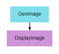
This pipeline’s primary purpose is to show how graphics can be output and viewed. A random noise image is generated and displayed using matplotlib’s pyplot library. Any graphic displayed using the plt.show() function can be viewed in the executions tab.
from matplotlib import pyplot as plt
from random import randint

class DisplayImage():
    def execute(self, image):
        if len(image.shape) == 4:
            image = image[randint(0, image.shape[0] - 1)]
        plt.imshow(image)
        plt.show()
Display Random CIFAR-10
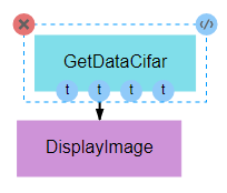
As with the previous pipeline, this pipeline simply displays a single image. The image from this pipeline, however, is more meaningful, as it is drawn from the commonly used CIFAR-10 dataset. This pipeline seeks to provide an example of the input being used in the next pipeline while providing an example of how the data can be obtained. This is important for users who seek to develop their own pipelines, as CIFAR-10 data generally serves as an effective baseline for testing and development of new CNN architectures or training processes.
Also note, as shown in the figure above, that it is not necessary to utilize all of the outputs of a given node. Unless specifically handled, however, it is generally inappropriate for an input to be left undefined.
from keras.datasets import cifar10

class GetDataCifar():
    def execute(self):
        ((train_imgs, train_labels),
        (test_imgs, test_labels)) = cifar10.load_data()
        return train_imgs, train_labels, test_imgs, test_labels
Train CIFAR-10
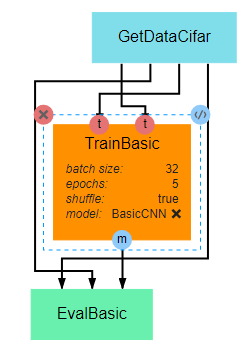
This pipeline gives a very basic example of how to create, train, and evaluate a simple CNN. The primary takeaway from this pipeline should be the overall structure of a training pipeline, which should follow the following steps in most cases:
- Load data
- Define the loss, optimizer, and other metrics
- Compile model, with loss, metrics, and optimizer, using the compile() method
- Train model using the fit() method, which requires the training inputs and outputs
- Output the trained model for serialization and/or utilization in subsequent nodes
import numpy as np
import keras

class TrainBasic():
    def __init__(self, model, epochs=20, batch_size=32, shuffle=True):
        self.model = model
        self.epochs = epochs
        self.batch_size = batch_size
        self.shuffle = shuffle
        return

    def execute(self, train_imgs, train_labels):
        opt = keras.optimizers.rmsprop(lr=0.001)
        self.model.compile(loss='sparse_categorical_crossentropy',
                        optimizer=opt,
                        metrics=['sparse_categorical_accuracy'])
        self.model.fit(train_imgs,
                    train_labels,
                    batch_size=self.batch_size,
                    epochs=self.epochs,
                    shuffle=self.shuffle,
                    verbose=2)
        model = self.model
        return model
class EvalBasic():
    def __init__(self):
        return

    def execute(self, model, test_imgs, test_labels):
        results = model.evaluate(test_imgs, test_labels, verbose=0)
        for i, metric in enumerate(model.metrics_names):
            print(metric,'-',results[i])
        return results
Train-Test
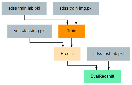
This pipeline provides an example of how one might train and evaluate a redshift estimation model. In particular, the procedure implemented here is a simplified version of work by Pasquet et. al. (2018). For readers unfamiliar with cosmological redshift, this article provides a simple and brief introduction to the topic. For the training process, there are two primary additions that should be noted.
First, the Train class has been given a function named to_categorical. In line with the Paquet et. al. method linked above, this tutorial uses a classification model rather than a regression model for estimation. Because we are using classification models, the keras model expects the output labels to be either one-hot vectors or a single integer where the position/value indicates the range in which the true redshift value falls. This function converts the continuous redshift values into the necessary discrete, categorical format.
Second, a class has been provided to give examples of how researchers may define their own keras Sequence for training. Sequences are helpful in that they allow alterations to be made to the data during training. In the example given here, the SdssSequence class provides the ability to rotate or flip images before every epoch, which will hopefully improve the robustness of the final model.
The evaluation node has also been updated to provide metrics more in line with redshift estimation. Specifically, it calculates the fraction of outlier predictions, the model’s prediction bias, the deviation in the MAD scores of the model output, and the average Continuous Ranked Probability Score (CRPS) of the output.
Train-Test-Compare
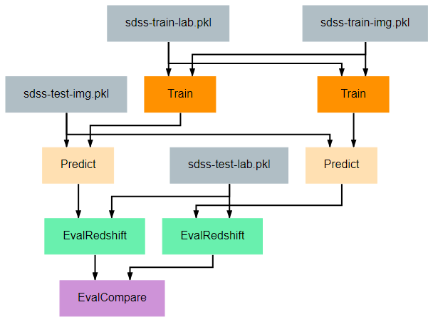
This pipeline gives a more complicated example of how to create visualizations that may be helpful for understanding the effectiveness of a model. The EvalCompare node provides a simple comparison visualization of two models.
Train-PredVis
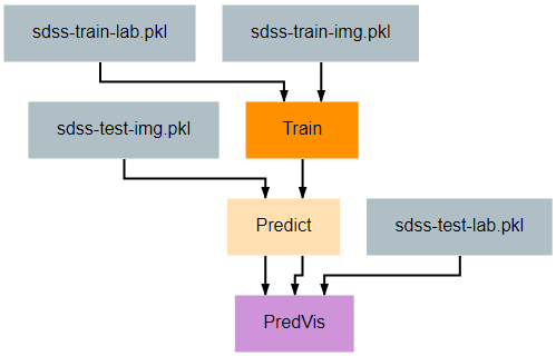
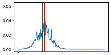
This pipeline shows another more complex and useful visualization example that can be helpful for understanding the effectiveness of your redshift estimation model. It generates a set of graphs like the one below that show the output probability distribution function (pdf) for the redshift values of a set of random galaxies’ images. A pair of vertical lines in each subplot indicate the actual redshift value (green) and the predicted redshift value (red) for that galaxy.
As shown in this example, any visualization that can be created using the matplotlib.pyplot python library can be created and displayed by a pipeline. Displaying these visualizations can be accomplished by calling the pyplot.show() function after building the visualization. They can then be viewed from the Executions view.
import numpy as np
from matplotlib import pyplot as plt

class PredVis():
    def __init__(self, num_bins=180, num_rows=1, num_cols=1, max_val=0.4):
        self.num_rows = num_rows
        self.num_cols = num_cols
        self.xrange = np.arange(0, max_val, max_val / num_bins)
        return

    def execute(self, pt, gt, pdfs):
        fig, splts = plt.subplots(self.num_rows, self.num_cols, sharex=True, sharey=True)

        num_samples = self.num_rows * self.num_cols

        random_indices = np.random.choice(list(range(len(gt))), num_samples, replace=False)

        s_pdfs = np.take(pdfs, random_indices, axis=0)
        s_pt = np.take(pt, random_indices, axis=0)
        s_gt = np.take(gt, random_indices, axis=0)

        for i in range(num_samples):
            col = i % self.num_cols
            row = i // self.num_cols
            splts[row,col].plot(self.xrange, s_pdfs[i],'-')
            splts[row,col].axvline(s_pt[i], color='red')
            splts[row,col].axvline(s_gt[i], color='green')
        plt.show()
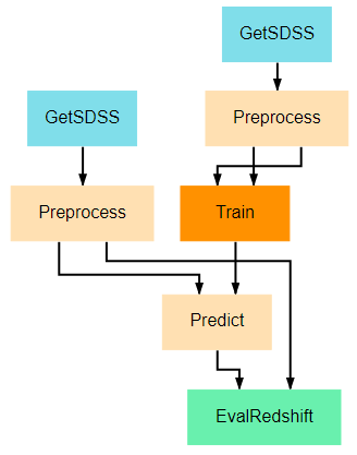
Download-Train-Evaluate
This pipeline provides an example of how data can be retrieved and utilized in the same pipeline. The previous pipelines use manually uploaded artifacts. In many real cases, users may desire to retrieve novel data or more specific data using SciServer’s CasJobs API. In such cases, the DownloadSDSS node here makes downloading data relatively simple for users. It should be noted that the data downloaded is not in a form easily usable by our models and first requires moderate preprocessing, which is performed in the Preprocessing node. This general structure of download-process-train is a common pattern, as data is rarely supplied in a clean, immediately usable format.